


A home’s ambiance is significantly influenced by personal preferences, beginning from the moment you enter. Art serves as a primary indication, establishing a mood that words often fail to express. When each piece celebrates the lives of the residents, the spaces within become intertwined and effortlessly enjoyable.

However, families are not uniform entities. They encompass various ages, interests, and preferences for comfort. Thoughtful design recognizes these variations while establishing a serene and unified setting for everyday activities.
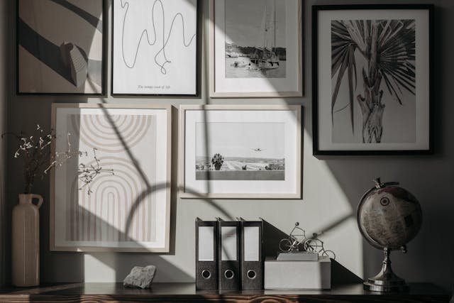
Taste as a Foundation for Belonging
Art that resonates with your daily life can transform a hallway or kitchen into a true home. A framed map from a cherished vacation or a print of regional flora acts as a communal touchstone. Visitors can instantly interpret these narratives upon entering.
Focus on communal spaces first. The living room often reflects the family’s identity, while the main suite may convey more subdued tones. Consider small experiments before making substantial purchases, like using taped printouts on walls to assess size and sightlines.
Select one element to unify the decor. A recurring theme, such as gentle curves or botanical designs, can weave together different areas without requiring exact matches. This balance is where design ideology and personal memories converge.
Creating Cohesion in the Bedroom
A restful environment requires subtle cues. Soothing colors, soft contrasts, and natural forms assist the nervous system in relaxation. Hand-drawn edges can evoke a tranquil atmosphere.
Begin by considering the wall behind your headboard. The appropriate size can frame the bed and manage the room’s focal energy. Discover ideas and seek bedroom wall art inspiration, then return to your favorites with renewed perspective. A basic mockup on your device can aid in visualizing dimensions.
Combine artworks that evoke similar feelings rather than a defined theme. A serene landscape and a peaceful abstract can harmonize if their lines and tonal values align. Opt for matte finishes to reduce glare.
Emotions, Memories, and Significance
Art can evoke desired emotional states you wish to experience each day. Tranquil abstracts in a bustling hallway can promote calmness, while a striking graphic might invigorate a slow morning. Memories also play a role, transforming a simple photo into a cherished daily reminder.
Prioritize meaning in your selections. A piece crafted by your child at six years old can co-exist alongside professional prints if the framing and spacing are considered carefully. Varied values do not equate to visual chaos as long as proportions are deliberate.
Consider penning a brief story for each space. In two sentences, clarify the mood you wish to create, then choose artworks that align with that vision. This approach simplifies decision-making during times of indecisiveness.
Guidance from Trends, Not Mandates
While trends can be inspirational, they should ultimately reflect your personal style. An article from the Associated Press highlighted a surge in interest for French cottage decor, indicative of a longings for nostalgia and comfort among many. Let this trend inform your choices, yet filter them through your family’s unique aesthetic.
Experiment with trends gradually. Introduce one new element at a time, such as a vintage floral design or a subtle gingham accent, and explore how it interacts with your existing art. If it resonates, keep it; if not, let it go.
Trends can change quickly. Your decor shouldn’t mirror fast fashion. Opt for art pieces that will still resonate in two years, allowing smaller decorative elements to reflect seasonal changes.
Confident Color Choices for Communal Areas
Colors carry emotional weight. Homes & Gardens has noted butter yellow as a prominent shade for 2025, suggesting a shift towards warmth and positivity. If this aligns with your family’s spirit, incorporate the hue throughout a couple of rooms for a harmonious flow.
Think of color as an adjustable dial. Bedrooms may be set to a lower frequency with subtler hues, while entrances can be bolder to convey energy. Maintain one neutral color throughout frames or mats to anchor the overall aesthetic.
Do preliminary tests with paper. Print swatches of your chosen colors and affix them at eye level. Observe them under different lighting conditions throughout the day. If a color feels unsettling at night, it likely won’t lose that quality.
Crafting Joyful Spaces Without Clutter
Spaces filled with joy need not be overwhelming. A report from Marie Claire highlighted a growing fascination with dopamine decor focused on uplifting colors and playful patterns. You can transform this concept into artwork using a few well-placed accents.
Use layered restraint for visual balance. Position a vibrant piece over the mantel, surrounded by calmer art to give the eye a place to rest. Happiness in design stems from equilibrium, not competition.
When you’re unsure, consider these straightforward guidelines:
- One standout piece per wall.
- Uniform frame thickness throughout the room.
- At least two hand widths between frames to allow for breathing space.
Your personal taste serves as the most dependable guide in selecting art for your family home. It reflects shared memories, establishes the right mood, and accommodates the natural rhythms of your life together. When your choices embody who you truly are, the spaces will envelop you in warmth.
Keep the process kind and straightforward. Experiment, rotate pieces, and discuss options together. The result will be a collection that narrates your shared experiences, rather than a mere catalog of trends.


Add Your Comment Cancel reply